Keepsake Quilting
DESIGN CHALLENGE
Complete rebranding: Logo, Catalog redesign, Website collateral, Print collateral
Keepsake Quilting is a multimillion dollar quilting supply retailer that serves the 4.2 billion dollar* quilting enthusiast sector.
*according the the craftindustryalliance.com, which estimates there is an estimated base of 21 million quilters
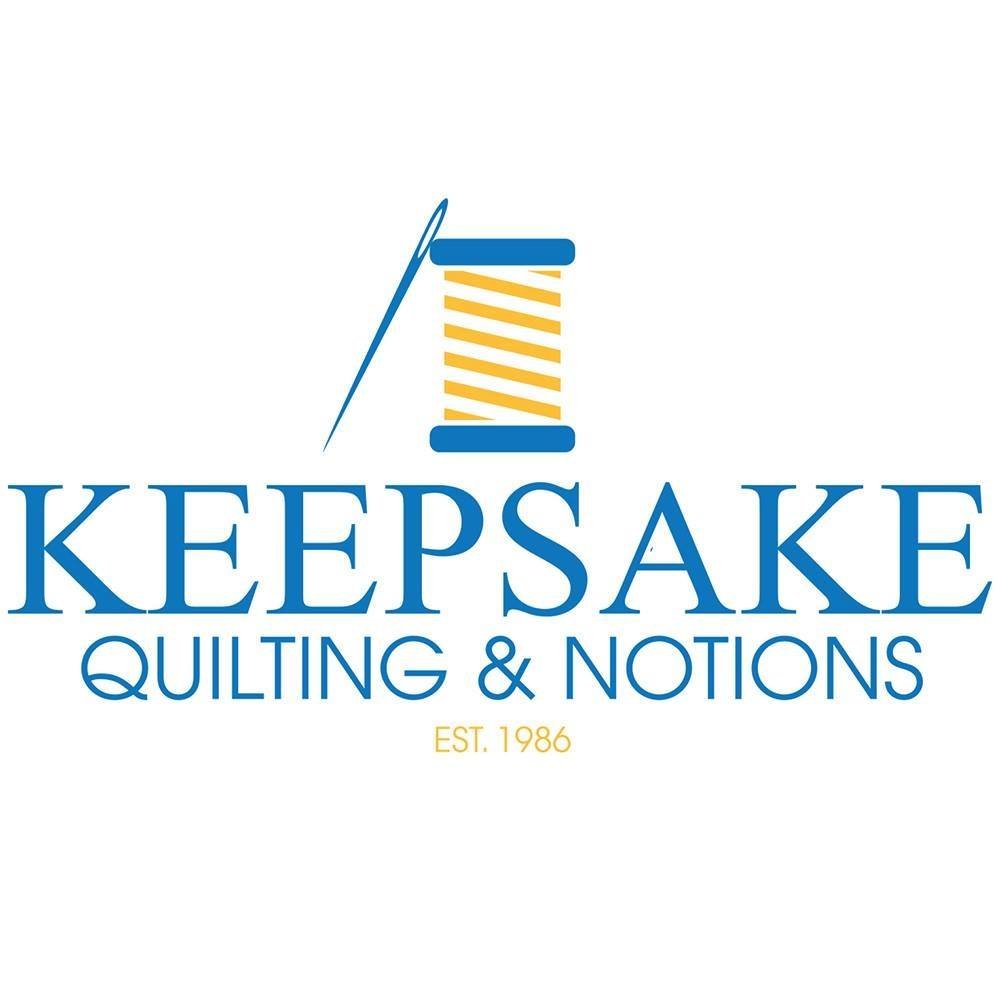
The last used Keepsake logo. Client wanted to keep the blue and yellow idea, but ditch these exact tones which match the Walmart colors.

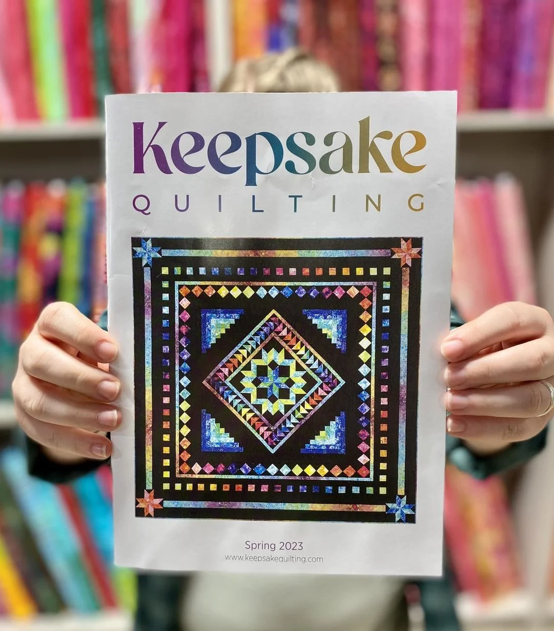
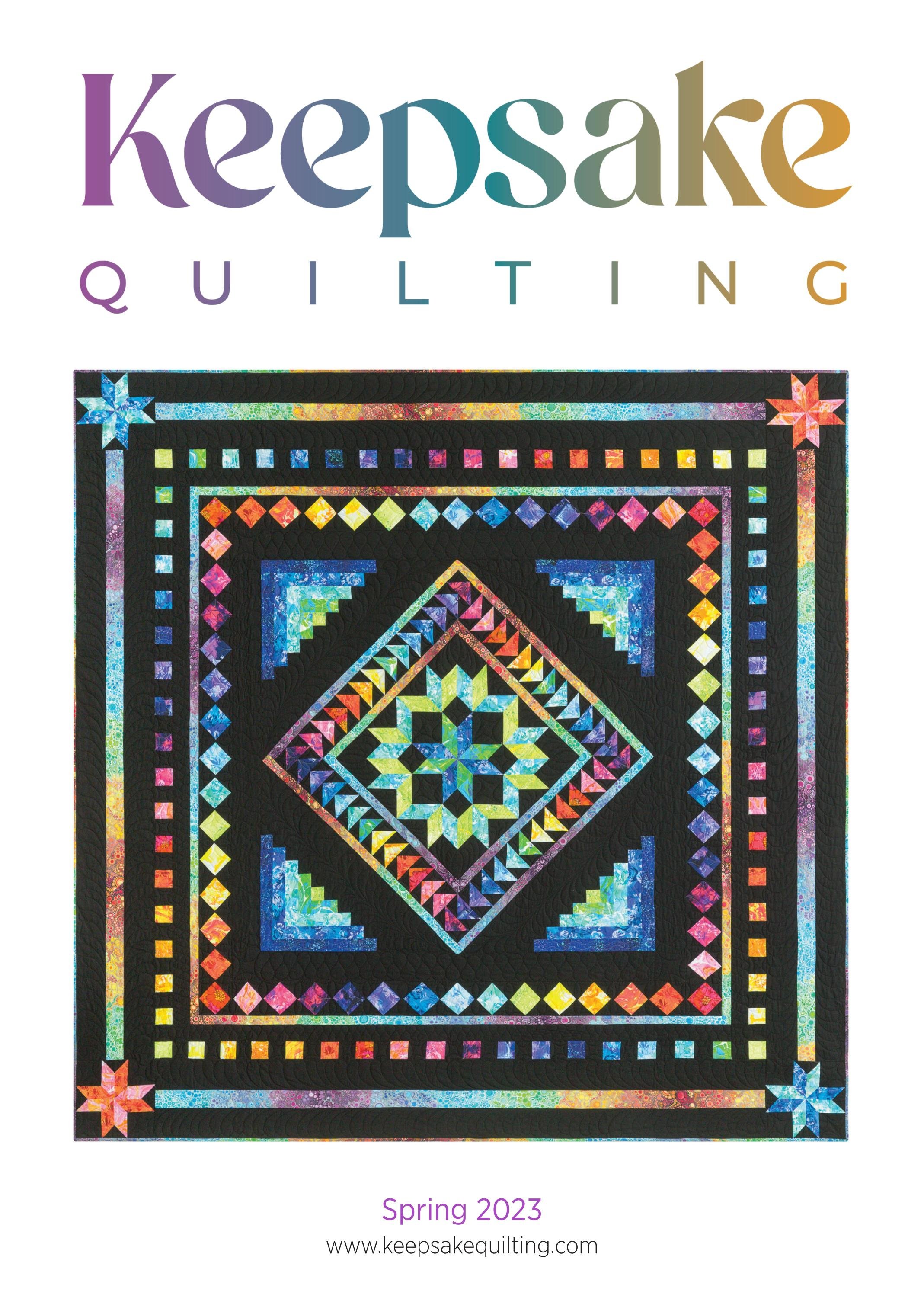
New logo in teal and gold. Keepsake typeface is chunky and friendly, yet not too modern. P was shortened a bit to accommodate the wide kerned type below, and also adds the the friendly, accessible feeling.
Company owner requested a rebrand that was in keeping with the company principles- friendly, customer service oriented, somewhat traditional yet edging toward modern, and that it somehow referenced the previous branding.
The final solution was a tweaking of the blue and yellow color scheme to a teal and gold, and adding an orchid color to the palette. The orchid color can be seen in the alternate logo, which is often used in applications where the quilts shown skew toward more modern.
The word Keepsake is rendered from the ‘Ringreat’ font. This display font is curvy, friendly, and inviting. Its large x height makes it a bold block that can hold it’s own over the lintel of the word below. Several of the letters were redrawn, in particular the p, which was shortened to accommodate the word ‘quilting’ below, which was rendered in all caps for stability and easy reading.
The gold color was a challenge to find a readable shade, as yellow is notoriously difficult against white. Many, many iterations were auditioned in many sizes until landing on the perfect combo.
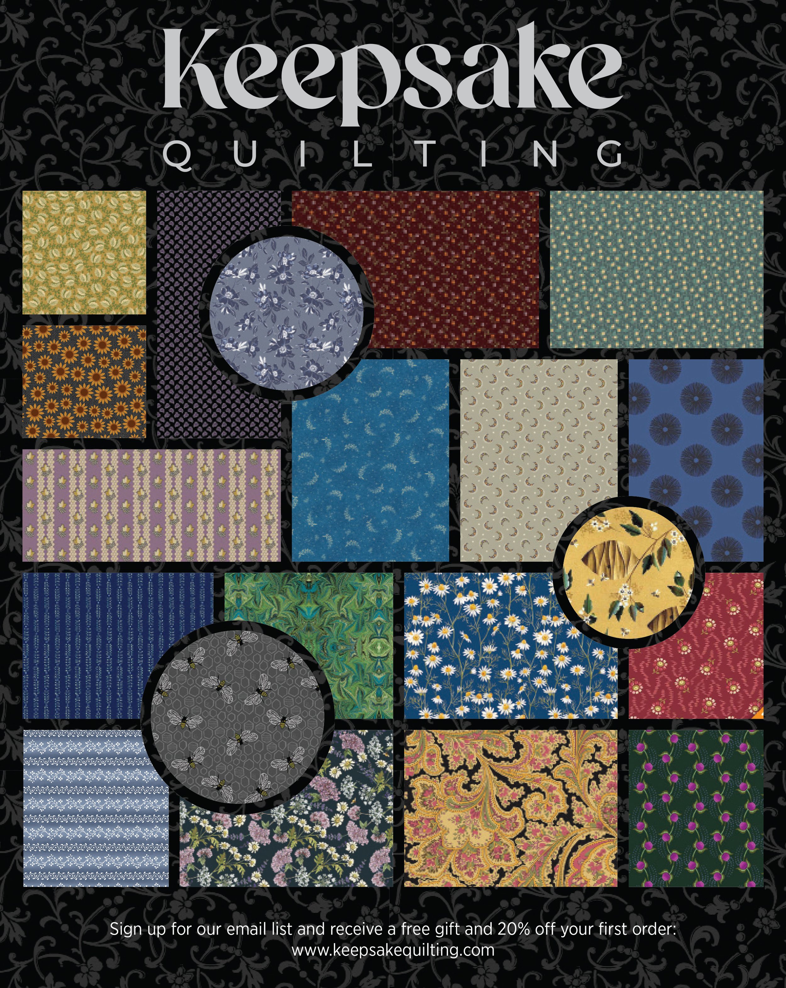
Full page print for Quiltmania magazine
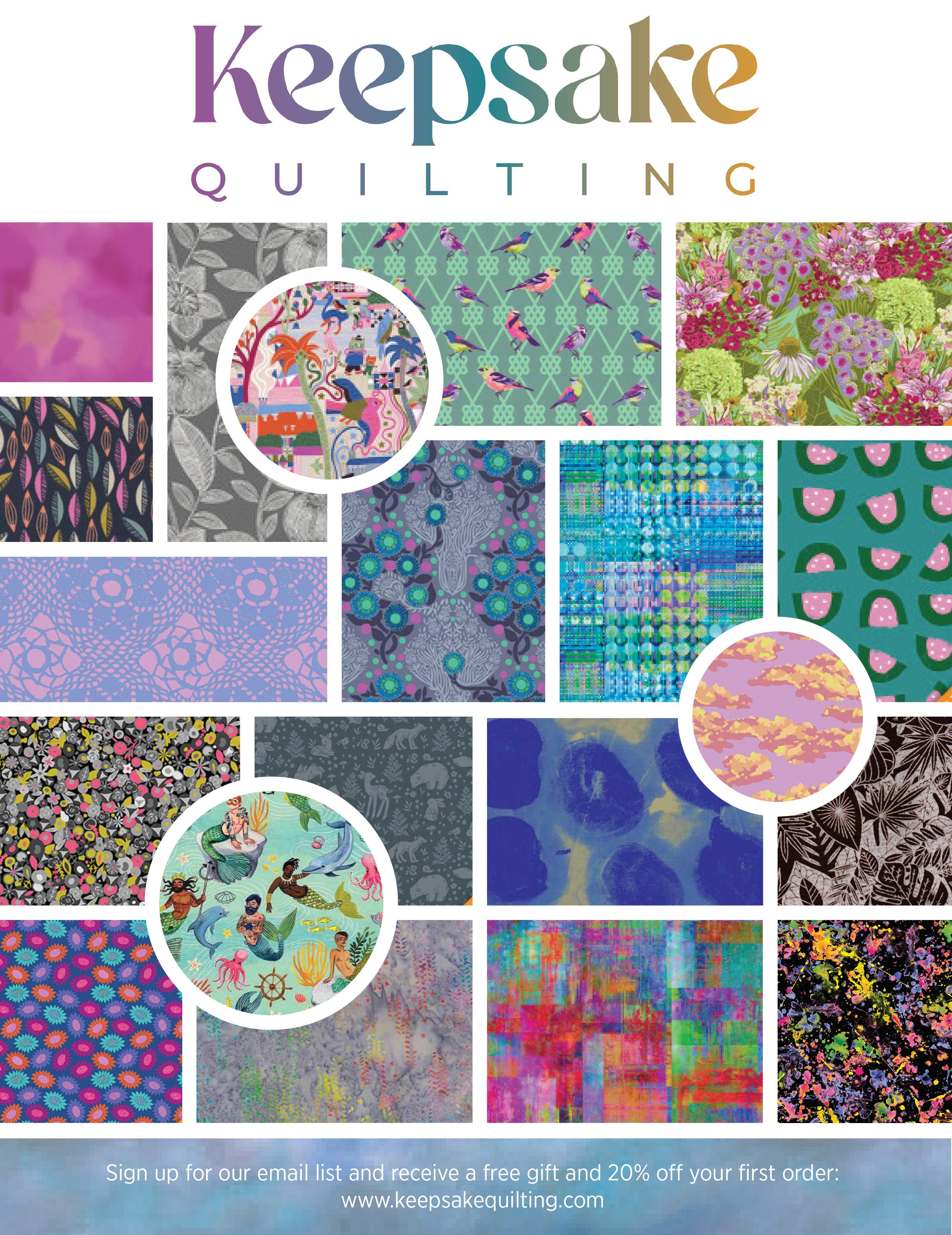
Full page print ad for Quiltmania's Simply Moderne Magazine

